5 tips to score points with your PhD defense
Could you also apply our presentation tips to a PhD defense?
This is a question we are often asked.
As if jury members at a PhD defense get all juiced up when seeing a set of incomprehensible slides packed with text and data, at which the researcher himself can hardly stifle his yawns.
Not happening.
Hooray for clear and persuasive presentations. Also at PhD defenses.

Let me introduce to you Conny Hoffmann, once a researcher of Political Sciences at the University of Antwerp.
Because Conny was well aware of life being too short for bad presentations, she had her department invite me to come give a presentation workshop.
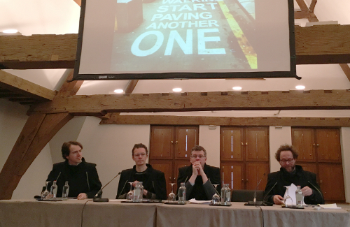
Now, one year later, Conny is presenting her PhD defense in front of a full house. I can’t help but notice that she is applying a handful of tips from the workshop, such as sticking to a clear structure and using attractive slides not containing too much text.
But what did the jury think?
 Whereas one of the jury members claimed that the dissertation had not been all that clear throughout, he did note that the presentation had nicely made up for that:
‘Congratulations on a presentation that clarified several points from your dissertation.’
Also Conny’s mentor commended this ‘very comprehensible presentation’.
Which tips had Conny applied?
1. Stick to the basics
The jury has already read through your dissertation. No need to recount everything. Use your presentation to portray the bigger picture and zoom in on your most important findings instead. Keep in mind JERI: Just Enough Relevant Information.
2. No more than 20 words per slide
Too much text on your slides, and your audience may just stop listening, or simply ignore your slides. Slides are in support of your story, not to provide your audience with a written background text. Remember, 20 words per slide, no more (less is much better).
3. A clear structure in three segments
Your intro will warm the audience up to your story. The middle segment talks about your initial problem, how you came to an answer and what that can teach us. Then comes your conclusion in which you provide your audience with an overview of the key points and draw a conclusion. A clear structure like this will make your story all the easier to follow.
4. Visual slides

Images bring ideas to life and will grab your audience’s attention. Images during a presentation tell a much broader story than text alone. Use photos, graphs, and why not even icons.
5. No template (or a subtle one)
Throw overboard any extras in your slideshow. Sure, include the logo and name of your institution on the title slide and final slide, but drop them from the remaining slides. They will only distract. A template is okay, but just for the title slide and final slide. Opt for a white background for any slides in between.
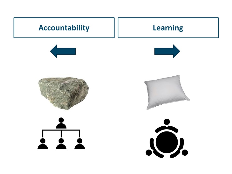
Conny applied even more tips, like opening with a powerful attention grabber and using metaphors to bring across complex ideas.
Will you also soon be defending your thesis?
Or are you and your research group looking for ways to up your presentation skills? Give us a holler and let us bring a customized workshop to your door!
(First picture: Anne Helmond, PhD defense Michael Stevenson)
