The Pitch Poster: a scientific poster with impact
Have you ever attended a scientific poster fair? A place filled with fascinating insights and ground-breaking research. Where you can tune in to riveting conversations with researchers passionate about their work. And forge new connections and build your knowledge.
At least. That’s how it should be.
Chances are that the poster fairs you have personally attended aren’t anything like the depiction above.
In reality, a poster fair is often an impenetrable bastion where every square inch of paper is crammed with text. Even if the most ground-breaking research were to be posted there, you would never know it.
I bet even the reception and coffee break seem more appealing to you than the thought of meandering around past each of those large sheets of paper.
Hundreds of hours of work and countless opportunities are wasted during such fairs, because scientific posters are not made properly.
No-one is blaming the researchers here: they simply look at how everyone else does it and copy that. Makes sense.
But here is the hard truth: a bad scientific poster has as much impact as a grain of sand on a bowling ball. Nothing budges.
Change is needed. And here is what we suggest:
Meet the Pitch Poster
We at The Floor is Yours have developed a new poster format that will display the essential information about your research in an accessible and appealing manner.
The two basic principles are:
- Your poster does the heavy lifting. It grabs people’s attention and presents the most important info in a clear and succinct manner.
- You provide additional explanation when people want to know more. Throughout the conversation, you dig deeper. A QR code makes it possible for those interested to conveniently gather even more info, also when you’re not there.
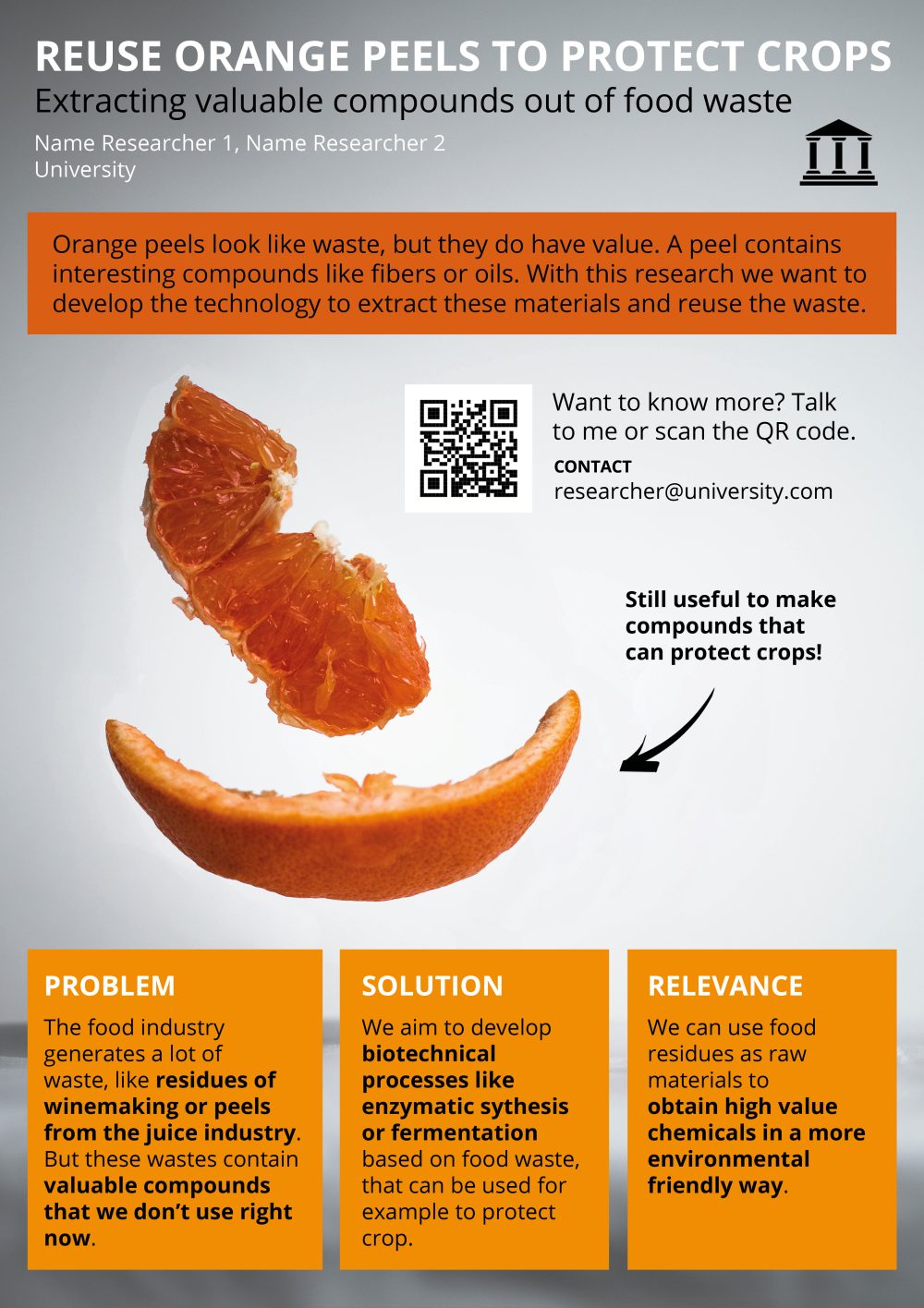
This is what a Pitch Poster looks like:

The five elements of a Pitch Poster are:
1. A brief and catchy title, possibly supplemented by a more technical subtitle.
=> A title should instantly tell people what the poster is about. Your audience should not have to analyse the title for a full two minutes in order to understand it.
2. A clear main message with plenty of space.
=> Don’t expect attendees to remember all the info contained on your poster. Give your main message a central place on your poster and ensure it can be understood quickly. Your audience will be sure to remember that.
3. Three blocks. One for the problem, one for the solution and one for the benefit.
=> Problem, solution, benefit is the basic story structure people use in storytelling. Use those three blocks to explain (1) the challenge you are researching, (2) the solution you want your research to provide, and (3) the relevance of the research.
4. A large image.
=> Images draw attention. They make people pause by your poster. Important, because if they don’t do that, there is no impact. In a split second, an image gives a clear idea of what your research is about.
5. A QR code and contact information.
=> The QR code can be used to share additional information: an abstract, references, extra data, a handout, a link to your latest publication or project website, or any other information you are unable to include on the pitch poster. (For example, via goqr.me)
Those were the five elements of a pitch poster.
Resist the temptation to add more than this. People who would like to find out more will address you or scan the QR code. And before you know it, you’ll have struck up a real conversation.
We have seen thousands of scientific posters come through The Floor is Yours over the past ten years. With a Pitch Poster, we believe poster fairs will once again become places where your research will take the spotlight. A place where you will engage in meaningful conversations that can advance your career.
(And if you don’t believe us, why not ask us to organize a pitch poster fair for you. Perfect for testing on a PhD day, for example).
More tips for a winning scientific poster?
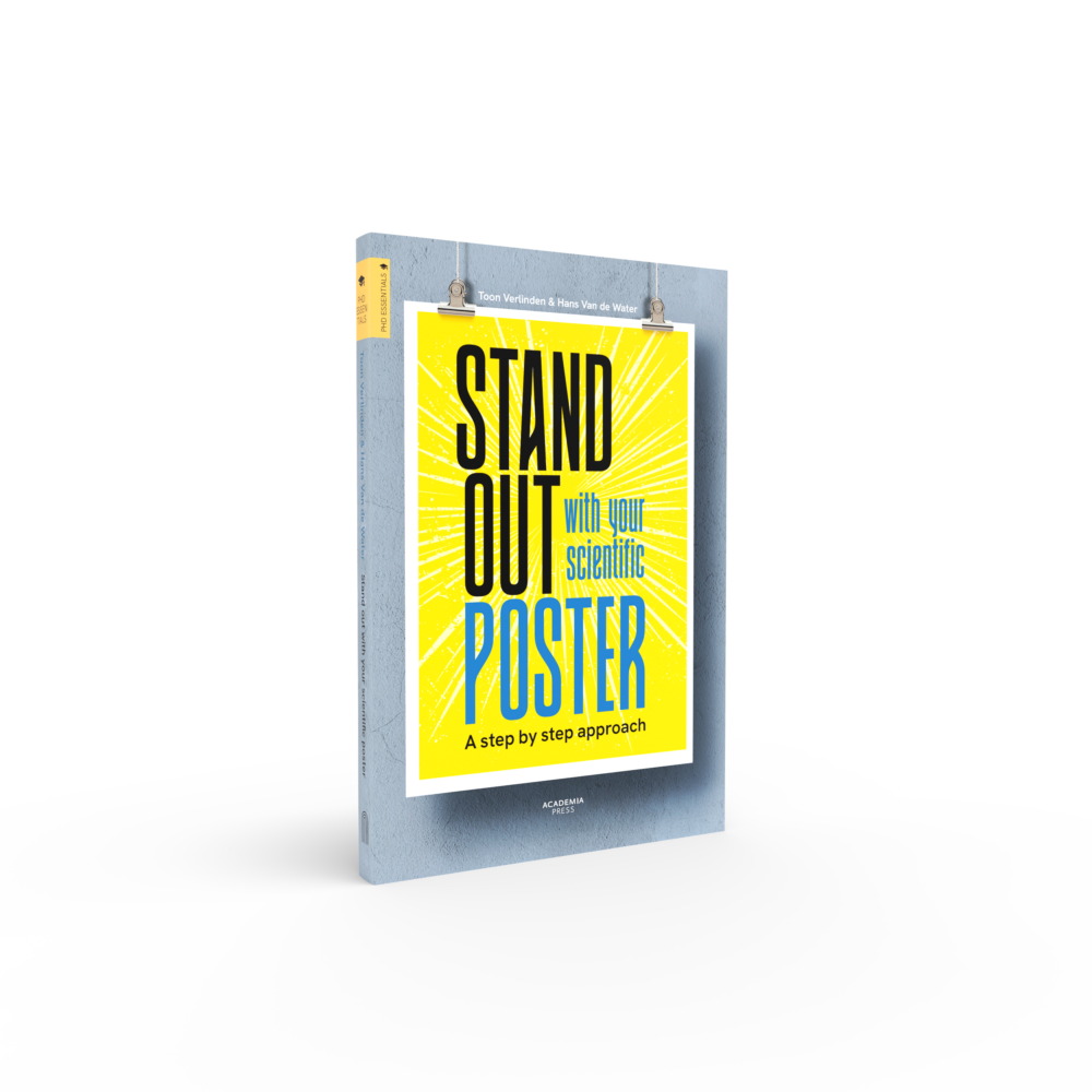
- Check out our book How to Stand Out With Your Scientific Poster. It gives you an easy, quick, step-by-step approach for scientific posters that make a difference.
- Or book a poster workshop. We trained thousands of researchers to build scientific posters. Fact: Participants consistently rate our poster workshop 9.5/10 and yes, we have the data to back it up.
