Lessons from an award winning scientific poster
From workshop to award
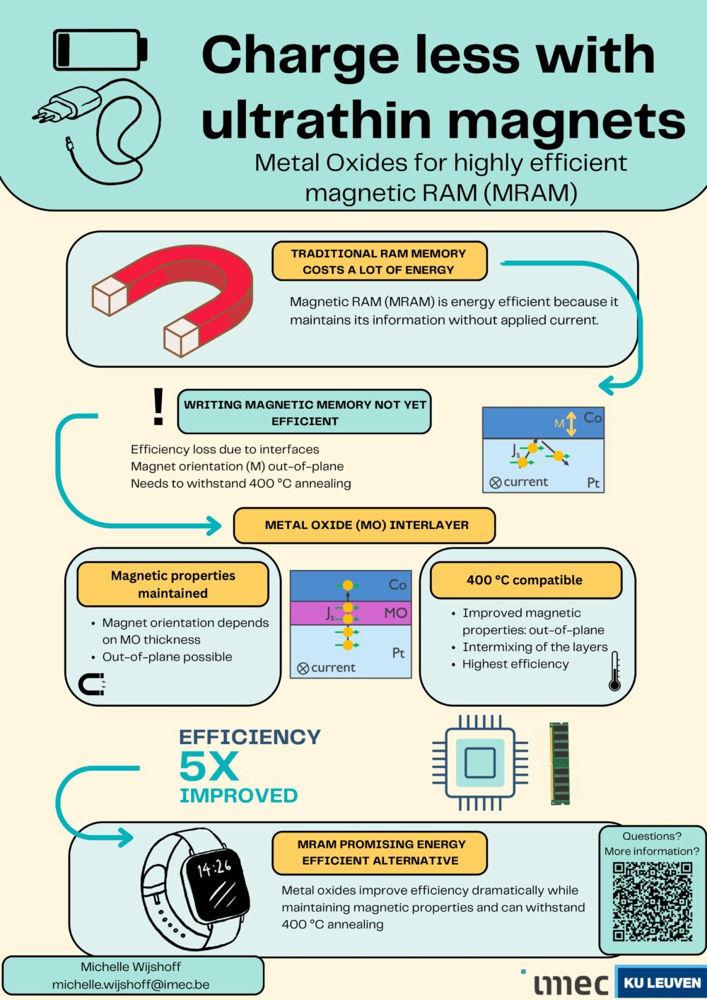
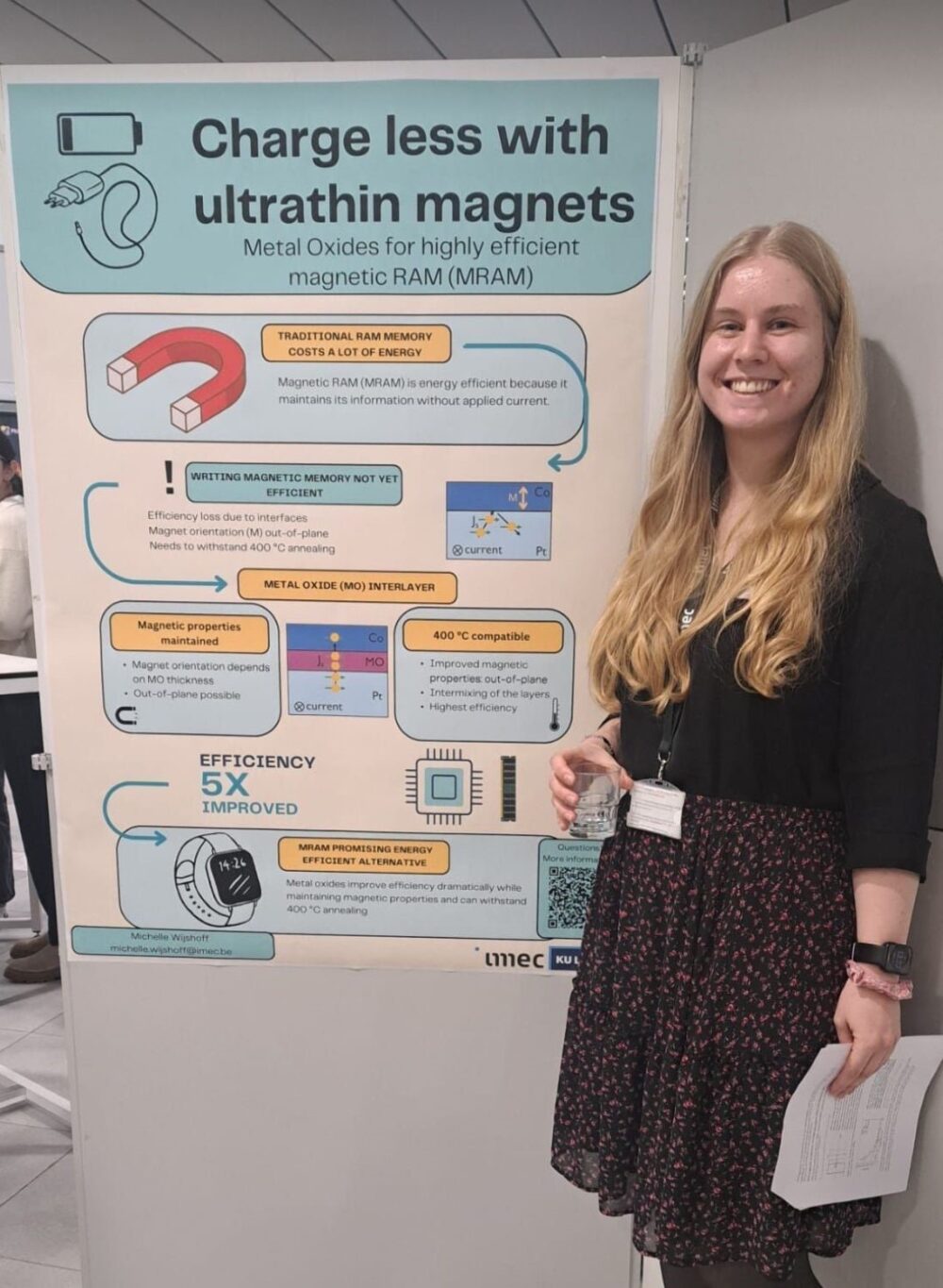
After a poster workshop from The Floor is Yours, Michelle Wijshoff, a researcher at imec, won a poster award for her poster on ultra-thin magnets. She presented her poster at an Imec PhDday. So the audience was all imec researchers, but doing research in completely different fields than Michelle.
Six reasons why we think this poster won
- Clear and appealing title: The title “Charge less with ultrathin magnets” is concise, clear and immediately communicates the key message/benefit of the research. The subtitle, which other researchers would typically use as their title, is less clear, but that’s ok. (Remember: the audience of other PhD students probably wouldn’t know what “efficient magnetic RAM” is.)
- Well-structured layout: The poster uses a logical flow with clear sections (problem, solution, results) that naturally guide the viewer’s eye from top to bottom.
- Effective use of visuals: The diagrams, icons and simplified illustrations effectively explain complex concepts in an accessible way, making the science easier to understand at a glance.
- This poster starts conversations: The limited number of words makes it easier for people to start a conversation: the poster is easy to scan and has just the right amount of information to get people talking.
- Practical relevance: The research is presented with real-world implications (energy efficiency and compatibility with current technologies), making it appealing to both academic and non-academic audiences.
- Visually appealing design: The use of contrasting colours, consistent fonts and clear organisation makes the poster visually appealing and professional.
Three lessons for when you want to get started yourself
- Focus on accessibility: Make sure your poster can be understood by both experts and non-experts. Simplify jargon, use visuals to explain key points, and highlight the broader implications of your work. You might be surprised: even at more narrowly focused conferences, there are plenty of non-experts in you field.
Example: I (Toon) did research on water purification. Still, at conferences there were a lot of techniques and theories that I hadn’t heard of before. I was a non-expert in many areas, even though I was an expert in my own niche of water purification. - Prioritize key information: Avoid cluttering the poster with text. Stick to the essential information and use descriptive headings and visuals to get your message across efficiently.
Example of a descriptive heading: ‘Traditional RAM energy costs a lot of energy’, says a lot more than ‘Introduction’. - Design for readability: Use a clean layout with consistent font sizes and colours. Choose a high-contrast colour palette, make sure graphics are high-resolution, and leave enough white space to avoid visual clutter. Researchers tend to be afraid of white space on posters. Don’t be.
Want to make an award-winning poster yourself?
- Check out our book How to Stand Out With Your Scientific Poster. It gives you an easy, quick, step-by-step approach for scientific posters that make a difference.
- Or book a poster workshop. Fact: Participants consistently rate our poster workshop 9.5/10 and yes, we have the data to back it up.
PS: We gave the workshop for Michelle and her colleagues at the request of SciMingo and imec. Also be sure to check out SciMingo’s offer for interesting individual workshops on science communication.