Slide design for dummies
Because all too many researchers struggle with the design of their presentation, I wanted to show you a couple of before-and-after slide examples. Extreme slide make-over!
For your information: I recently helped Marianne rework her thesis presentation. She approached me with a rough draft of her presentation, and that was what we started tinkering with. The master thesis raised the question as to whether general practitioners could possibly collectively organize their flu vaccinations to ease their work load.
1. Away with the watermark
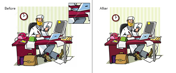
Marianne wanted to open her presentation with a story. Her opening slide shows an image of a doctor, up to his ears in work. This initial image contained a watermark. To remove the watermark we purchased the file for 2 Euros.

Time and again I see researchers grabbing images from the internet and mindlessly dropping them in their presentation or poster. This not only looks very unprofessional, but is ever so illegal (There has been a surge in Belgian organizations being sued for the illegal use of images). There are even companies that actively track these infringements for press agencies. When you decide to use a photo, just purchase it. Those extra €2 (presentation) or €15 (poster) will surely not make too big of a dent in your research budget.
2. Your title slide
Our one minor tweak to the title slide made all the difference: placing the title in a green box gave it a much more professional feel. The rest of the text was left untouched. I would have dropped the subtitle and names and instead mention those during my presentation, but Marianne decided to leave them there.

I created a similar example of a title slide during a recent presentation workshop. For this revision I opted for a photo background (pleasing to the eye and at a glance your audience knows the research involves fish) and placed the text in a blue box. I also divided the title into a main title and subtitle to make things clearer.

3. Find the main message
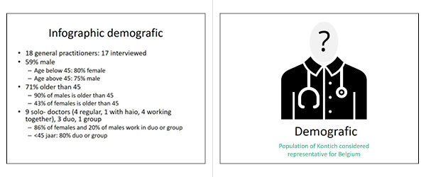
Marianne did quite some demographic research into the group of doctors in her region. Her first draft slide contained a large amount of text. Covering each of those bullet points would take too long. To fit everything into a 10-minute presentation she would need to drop some items.
To drop information, you first need to find the main message. The key message of this slide was that the doctors of Kontich have a similar demographic profile to that of other doctors in Belgium. We left that main conclusion on the slide, but dropped the rest. If Marianne wanted to elaborate on her main message, she could, but it wasn’t necessary.
The icon was slightly adjusted from an icon found at www.thenounproject.com.

4. Ditch the bullet points
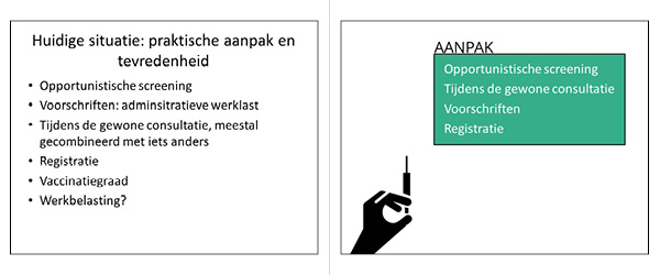
Choose your text, add a couple of bullet points … and get ready to have your audience doze off!
The problem with bullet points? They will put your audience to sleep. Why not throw in a box with a small icon instead? Keeping in mind her time limit, Marianne also dropped the items she would not be covering during her presentation. The icon came from www.thenounproject.com.

5. What to do instead?
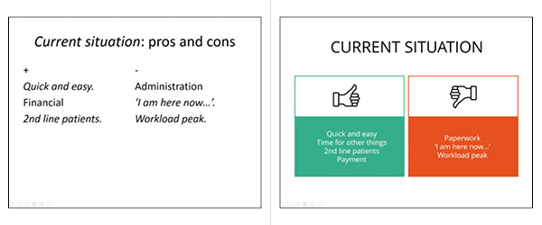
While most researchers would leave this slide as is, for me the standard columns simply had to go. The new design is clean and simple: one green and one red text box. Notice how we also trimmed the slide title. It is clear enough that the slide talks about the pros and cons of the system. Always ask yourself: how can I make my slide more appealing? And then you tweak until things feel right.

6. Simplify your graphs
My advice? Simplify your graphics without compromising accuracy. Even the axes were dropped in this example. (Big frown from my former instructor chemical engineering techniques, I’m sure.) This will result in a much more transparent slide.
What’s more, we dropped the title and brought in the question instead. Much clearer than the combination of title + question in the initial slide.
Conclusion: graphics are often too densely populated and contain too much superfluous information. Drop any excess baggage. And make your graphic’s question or conclusion the title.

7. Keep it consistent, keep it simple
The first slide design is on the right track, but the varying images give a cluttered effect. Using a series of uniform icons we took care of that.
In the revised version the icons appear on the slide one by one. The audience will see ‘six practical questions’ and then the first icon ‘location’ will appear. This way Marianne can first discuss the problem ‘location’, and then move on to each of the other points.

Not your cup of tea?
Many of you will agree to all of this, but then claim you cannot apply these tips to your research. Nonsense. Dropping bullet points, adding images or simplifying graphics, any researcher can do this. Take a good look at your slides, and you will find room for improvement.
Take your time. No need to take a design course.