How to create powerful charts?
The three best tips from Koen Van den Eeckhout
You’ve wrapped up your experiments, and you now have a massive amount of data you want to share in a presentation, publication or perhaps even in an infographic. But no matter how compelling your data is, a dry table or list of figures won’t stick with anyone. What you need is a clear and attractive graphic. So how do you get started?
We reached out to data visualisation specialist and founder of Baryon, Koen Van den Eeckhout, who shared with us his three biggest tips.
First tip: Keep your audience in mind!
Sounds straightforward, because if they don’t understand it, your graph will be useless. Really consider who will be viewing your graph.
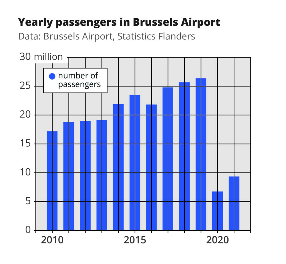
Suppose you did some research on luminous materials. You present your results to an audience of students, but the graph you share in your presentation comes straight from your latest publication:
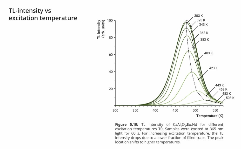
You quickly understand that this will not work. The graph is difficult to read, contains jargon, abbreviations and too much text to read in a short time. It is not adapted to your target audience.
Before you create your chart, ask yourself the following questions:
– What do they already know, and what don’t they know yet?
– What decision do they need to make, and what data should you show to help them do so?
– How much time will they spend looking at your chart? For example, if you show your graph during a presentation, the message should be clear in the half minute it is visible, and everything should be legible – even from the back row!
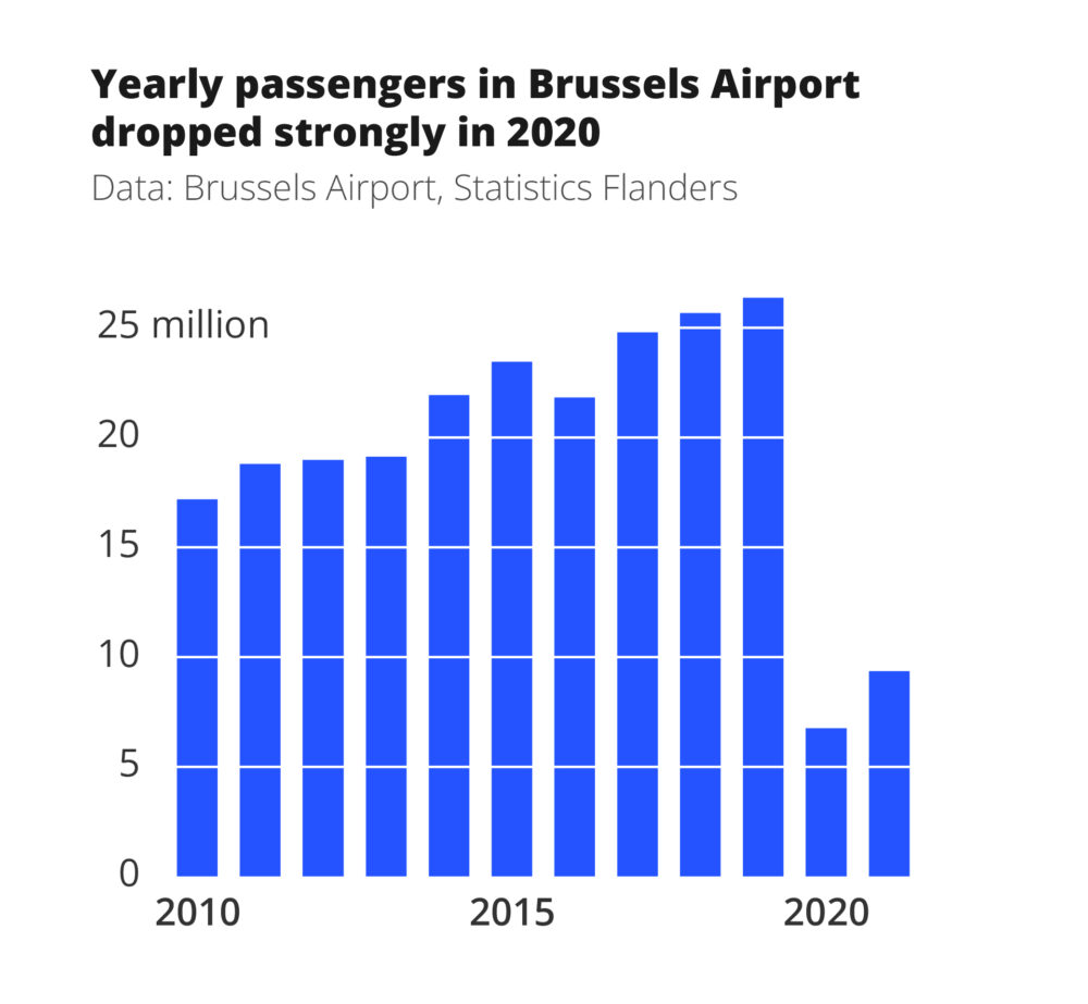
A better version of our chart would look like this:
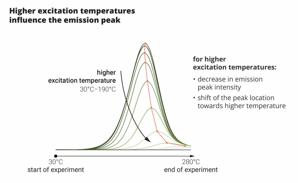
We now have less text and no more abbreviations or jargon. This makes it understandable to our audience of students as well. Moreover, it takes less time to understand the chart, and everything is easy to read.
Second tip: Make sure you have a clear message
The message you want to convey with your graph should be clear and powerful.
Below is a chart that, while beautifully designed, is simply missing a clear message:
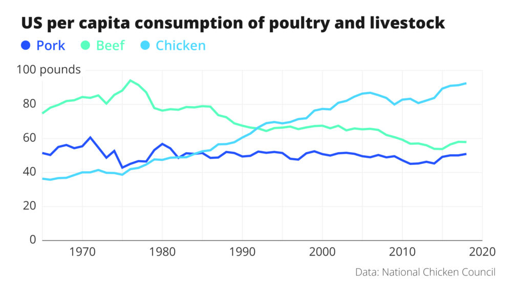
The graph shows us the data, but leaves the thinking to the audience. As viewers, we don’t know what makes this graph so interesting or surprising.
Now here is the same data, but with a slightly modified graph:
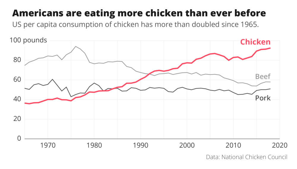
The message is now loud and clear: Americans are eating more chicken than ever before!
What did we change?
1. The title has a clear message. And so not just a description of what data you are showing.
2. By making clever use of color, the audience knows what to look at. The two lines for beef and pork are made gray, so they fade into the background a bit more, and the line for chicken is given a bright accent colour.
With those two minor changes, the graph suddenly does tell a story!
Tip 3: Reduce noise
The right signal-to-noise ratio is important.
What do we mean by signal? That is our message. We want to make that as clear as possible.
And the noise? That’s everything that gets in the way in our graph. See something in your graph that you could leave out, without harming the message? That’s noise!
The following graph contains plenty of noise:
We could easily leave out several items, like the gray background colour, the grid lines, the legend and even the axes!
This is the result:
This graph is much clearer without all the noise.
Note that removing noise doesn’t always imply leaving out elements of the graph. Sometimes we can also add things that make it just a little easier for our audience to understand what you want to say.
Consider, for example, the graph on chicken consumption in the US, where we added a striking accent colour to make the message more prominent.
And you may have noticed that we also changed the title. That immediately makes the message loud and clear.
So ask yourself the right questions
To arrive at a powerful graphic, it should:
1. be useful to your audience,
2. with a clear message,
3. and little noise.
Those three principles will ensure that the graphics in your next presentation, poster or article are bound to inspire and persuade!
Is it worth all that effort?
Making a good chart takes time. So, is it worth the effort? The answer is “yes! Because a chart helps you remember complex things better.
Why is that? Because of the so-called ‘dual coding’ principle: when we see the same information simultaneously as a figure and as text, different parts of our brain are stimulated at the same time. As a result, the brain is much more active, it is easier to learn new things, and also to remember them afterwards.
Want to know more about powerful graphics?
Koen Van den Eeckhout published the book Powerful Charts, that is filled with useful tips and practical examples to make your charts not only correct, but also clear and attractive. You will learn how to choose the right type of graph, which colours to use and which pitfalls to avoid.
All info on the book can be found here: https://www.borgerhoff-lamberigts.be/shop/boeken/powerful-charts (€35)