A lazy researcher fills his slides with a lot of text
One of the reasons why researchers are often hesitant to apply our tips is because they think it will come across as lazy. A single photo on their slide instead of lots of text? They’re afraid their promoter or colleagues will respond with “You sure made it easy on yourself, didn’t you? Just added a photo to the slide.”
Of course that is not true.
On the contrary. It takes much more effort to formulate your thoughts clearly and find a fitting photo, than to simply copy-paste your results from a paper onto a slide. So where does that fear stem from? Maybe because it is not a common practice in the research world?
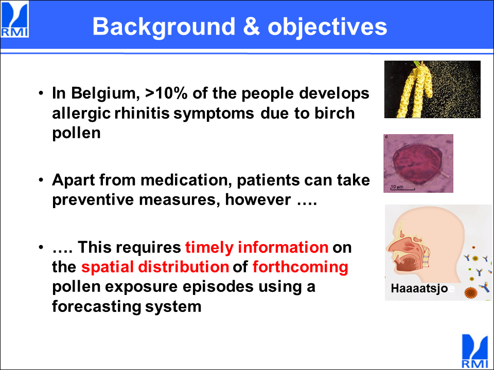
Let’s study a few examples that illustrate just how powerful less text can be. With this slide on allergy to (pollen from) birch trees, for example.

Take a look at this slide and ask yourself: what can the researcher say about this? Well, he will probably say that
- more than 10% of Belgians are allergic to birch pollen,
- apart from medication they can take preventive measures,
- this requires timely information on the spatial distribution of forthcoming pollen exposure episodes using a forecasting system.
The researcher will simply repeat what is already on the slide. And he will probably repeat it after people have already read it from the slide.
That makes it difficult for your audience to remain attentive. Instead, it will put them to sleep.
A much better option would be to delete the text and replace it with a photo of birch trees.

Now the researcher could add that more than 10% of Belgians are allergic to birch pollen, that they can take preventive measures, but must receive correct information.
There are several advantages to this approach:
- You are the one presenting, not PowerPoint. People must listen to you if they want to know what it’s about. They cannot simply read it.
- You won’t repeat yourself. Repeating what is already on your slide is simple overkill.
- Your slides become calmer and easier to process.
Some text after all?
Should you then drop all text from your presentation? Of course not. This is often not feasible: you do still want to add graphs, tables and several key words to your slide that serve as stepping stones.
But be aware of the text you add to your slides: much of it is unnecessary and often you will garner the same effect with an image, possibly supplemented with a few extra keywords.
Like this:

Then you can say: “These are birch trees. Did you know that more than 10% of Belgians are allergic to the pollen they produce? Luckily, those people can also take preventive measures in addition to medication, but then they must be informed correctly and on time about the presence of the pollen.”
Would you call this a lazy option?
No. On the contrary! When you choose to leave out text in favor of images, I would call that more of a challenge: you can no longer read directly from the slides, for which you’ll need to be more confident. It’s a bolder move to go with just a photo.
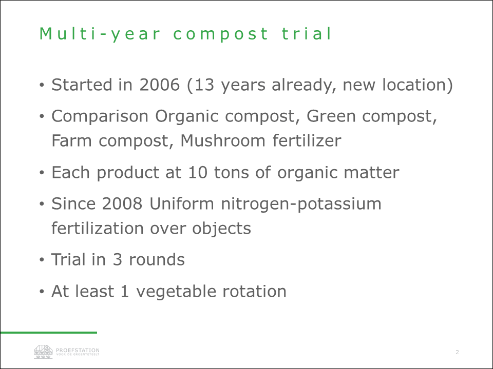
Another example to wrap up. The slide below describes an experiment. It contains an explanation of a multi-year compost experiment. Same story: the researcher will share with his audience exactly what is already on the slide.

Better to do it like this and simply tell the rest:

Your audience will be much more attentive with this new approach.
Don’t be fooled, a presentation containing photos and little text will never be the lazy option.
Conclusion
- Is it lazy to cut out text? No.
- Does it require more thinking? Yes.
- Will it create better presentations? Yes.
- Then why don’t researchers do it? This requires further research.
PS: I would like to thank Willem Verstraeten of the Royal Meteorological Institute and Joris De Nies of the Research Station for Vegetable Cultivation, two far from lazy researchers whose slides I was permitted to use and edit as an example for you.
PS2: Someone made the valuable comment that more text can sometimes be of added value to an international audience. Especially if the speaker’s English has a heavy accent, it can be a tool to follow the presentation anyway. That’s totally true! But also in this case we recommend working with keywords, rather than sentences.