Why general practitioners are bad presenters, and what you could learn from this

The guidelines for the thesis presentations for our future general practitioners (GP’s) are as follows:
Give a 10-minute presentation containing no more than 10 slides with a maximum of 12 lines per slide.
The ICHO -the Flemish organization overlooking our GPs’ training- meant well, drawing up these guidelines, but they have definitely fallen short.
No more than 10 slides
Let’s start with the guideline: ‘no more than 10 slides’. You’ve surely heard of a maximum number of slides to be displayed per hour, 15 minutes or minute before. Opinions will range from ‘1 slide per 5 minutes’ to ’10 slides per hour’, etc.
But these guidelines are no more than a flawed form of patching up and do not tackle the root of the problem. Whereas it will slow down over-eager presenters, it fails to address the fact that people will nonetheless want to cram their presentation with information.
Giving these persons 10, or 30 slides, will not make a difference: the amount of information will remain the same. Fewer slides, and the slide content will just become denser. Not the number of slides is the issue, but the fact that people do not drop details or secondary items from their presentation.
This guideline also stands in contrast to a most wonderful technique of creating an appealing and organized presentation: sticking to 1 idea per slide. Create bite-size and clear slides, by not cramming 3 different experiments or conclusions onto a single slide. Keep your audience from skipping over to conclusions #2 and #3 before you have finished discussing conclusion #1.
Our counter-advice: use as many slides as you need to tell your story and give your text the room it needs. But stick to the time provided.
Give a 10-minute presentation
‘Give a 10-minute presentation’, this guideline we do like. A most common mistake, especially during thesis presentations, is that of its presenter speaking too long. The jury won’t like it because they want to have time for questions, nor will your audience, and it is bound to reflect poorly on your entire work.
Our suggestion is to use as many slides as you need, but make sure you can unhurriedly go through them within the time provided. Do not work your way through 100 slides in 10 minutes. Unless you couldn’t care less about your audience.
A maximum of 12 lines per slide
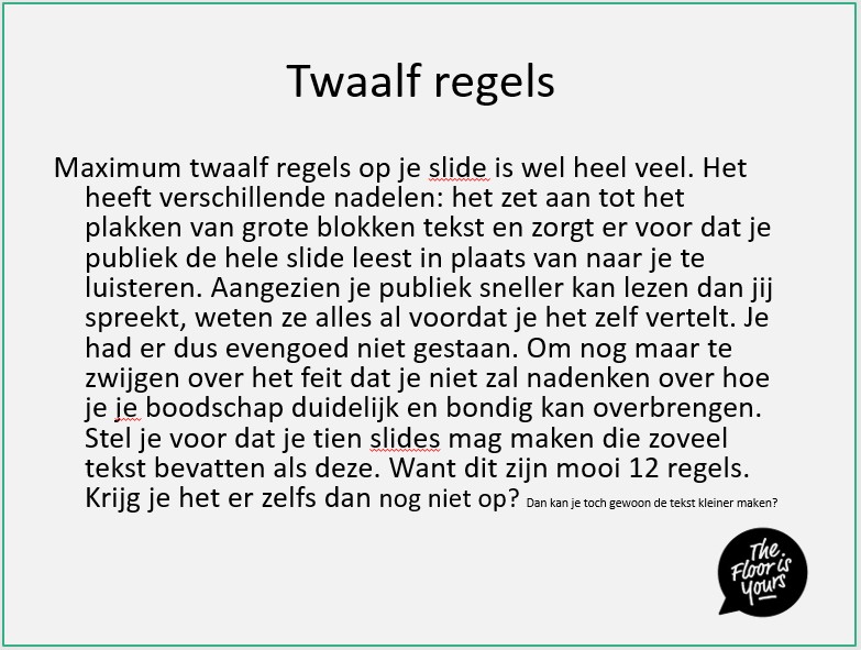
And then there’s that ‘maximum of 12 lines per slide’ guideline. Pretty senseless, if you ask us: Unable to fit everything onto your slide in 12 lines? Well, then reduce your font-size.
The guideline fails to address the fact that 12 lines is just too much. A welter of words like that is unclear, encourages people to incorporate entire protocols and codes in their presentations and has your audience reading rather than listening to you. You are much more important than your slides! But we must have already mentioned that, I think?
Our advice? Stick to a maximum of 20 words per slide. You will at times go over this number, but let this be a better guide value to you than the ‘maximum of 12 lines’.
What does 12 lines even look like? It’s the same lenght as the paragraph of text you just read!
(Dutch slide below, but you get the idea 🙂

But I’m being told to do it like this
As many slides as you want
As little tekst possible
Within the time provided
So much for the ideal presentation.
Enter reality: if these ridiculous guidelines are set by the jury of your work, you will simply need to adhere to them. The jury is always right, no matter how bizar their demands. A shame, naturally. But they are the ones at fault, and not you.
We can only address those people drawing up guidelines like these, or those of you who are part of a jury: do think twice. You can make things better!
By following our guidelines, that is. Let me know your thoughts.
… or am I now the idiot blindly setting new guidelines?