Creating a poster in 4 clear steps

Our blog is filled with advice on how to create your next poster. And yet, many researchers are simply not applying those tips. Why is that?
Are the many tips blurring your very first step? Do you revert to old habits, the minute your gaze hits that blank piece of paper?
For that reason, very practical, creating a scientific poster in 4 clear steps:
- Compose a 260-360 word text
- Find a clear/surprising/funny image to depict your research
- Sketch your poster on a piece of paper
- Start your computer. Position the image on your page and then place your text around it.
This is your roadmap. Let’s delve into the details now.
1) Compose a 260-360 word text
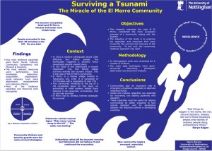
Why that number of words? The annual poster competition at Nothingham University provided us with plenty of prize-winning posters for us to use in our analysis. The prize winners’ posters each contained an average of 260 words, hardly one half Word document. Am I right about your current poster containing more text than that? Drop that text into Word and begin rewriting until your count is down to 260-360 words.
Naturally, that number is not set in stone, and 400 words will also do the trick. Anything is better than the 1320 words that are perhaps on your current poster. Do you have fewer than 260 words? Great! But do check to see whether your poster does not contain too little information, and is still clear enough. Want to know what 260 words look like? This very post up to this point, is just around 260 words.
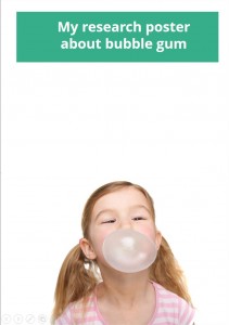
2) Find a clear/surprising/funny image to depict your research
You have your text ready. Now find an image that will nicely depict your text and will draw people’s attention. Very important: include at least one element on your poster that will make people’s heads turn when passing by. An image is the most efficient and clearest way to do this. Look for images that can be blown up in size.
Images containing lots of ‘negative’ space, or room to place text on or aound. Don’t know where to look for images? Make sure to read this post: Professional photos for your presentation or poster.
When looking for a good image, imagine that you are ‘selling’ your poster. This word may have a negative connotation in the world of research, but you do after all need to give people a reason to stop by your poster. If they don’t come, you can’t tell your story. An image will give them a reason to stop by, or at least have them give your poster a second glance.
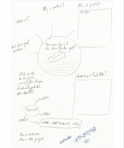
3) Sketch your poster on a piece of paper
Once they have their text and image ready to go, many people will turn on their computer and begin typing in Powerpoint (among researchers still the software of choice to create posters). The downside to this is that you will soon become frustrated of dragging back and forth boxes and such. By starting out without a real plan, it will take you much longer to draw up your poster, resulting in a poorer result. Really.
Begin by sketching your poster. Where will you place the image? And where will your text boxes and graphs go? This can be a rough draft, but make sure you think this through ahead of time.
4) Start your computer. Position the image on your page and then place your text around it.
When you start working at your computer, first place your image on your poster, and only then the text. This is crucial. Many researchers work the other way around, resulting in the image eventually being dropped in a lost corner of your page.
Your poster will look all the nicer if your image is large enough and has enough breathing room. If you’re not able to add enough text around your image, that usually means you have too much text.
Another reason why researchers don’t like to begin by positioning their image, is because they’d rather play around with standard boxes and templates they are used to. Forget about this. Why not put the method text box next to your introduction text, instead of underneath, if this fits better?
So, allow me to repeat this one more time.
Only this time with an image you can save, print and even hang next to your computer. Or forward it to that colleague of yours who will soon be making a poster! Images always do the trick. But I must have mentioned that already, right?
And in case you were wondering: this text – including the infographic – is around 800 words. Many posters contain almost double that. See why that is not a good idea? Why you can’t expect people to be reading such a chunk of text, standing up?
Good luck with your next poster presentation!